

The Herff Jones catalogs for high school students are an annual project, one that takes about 3-4 months from inception to press. Experimental design began in January 2024 as I worked on several mockups and possible design directions. For reasons that were more political than design-oriented, we didn't end up straying too far from our baseline the previous year, but some concepts did make it through to the final style in some fashion. For a look at those concepts and the reasoning & inspiration for each, check out the Rejected Concepts section at toward the bottom of this page.
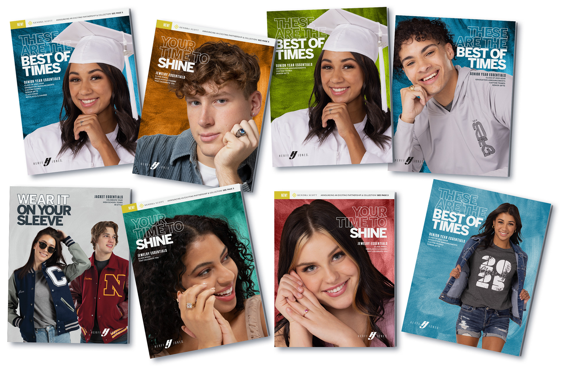
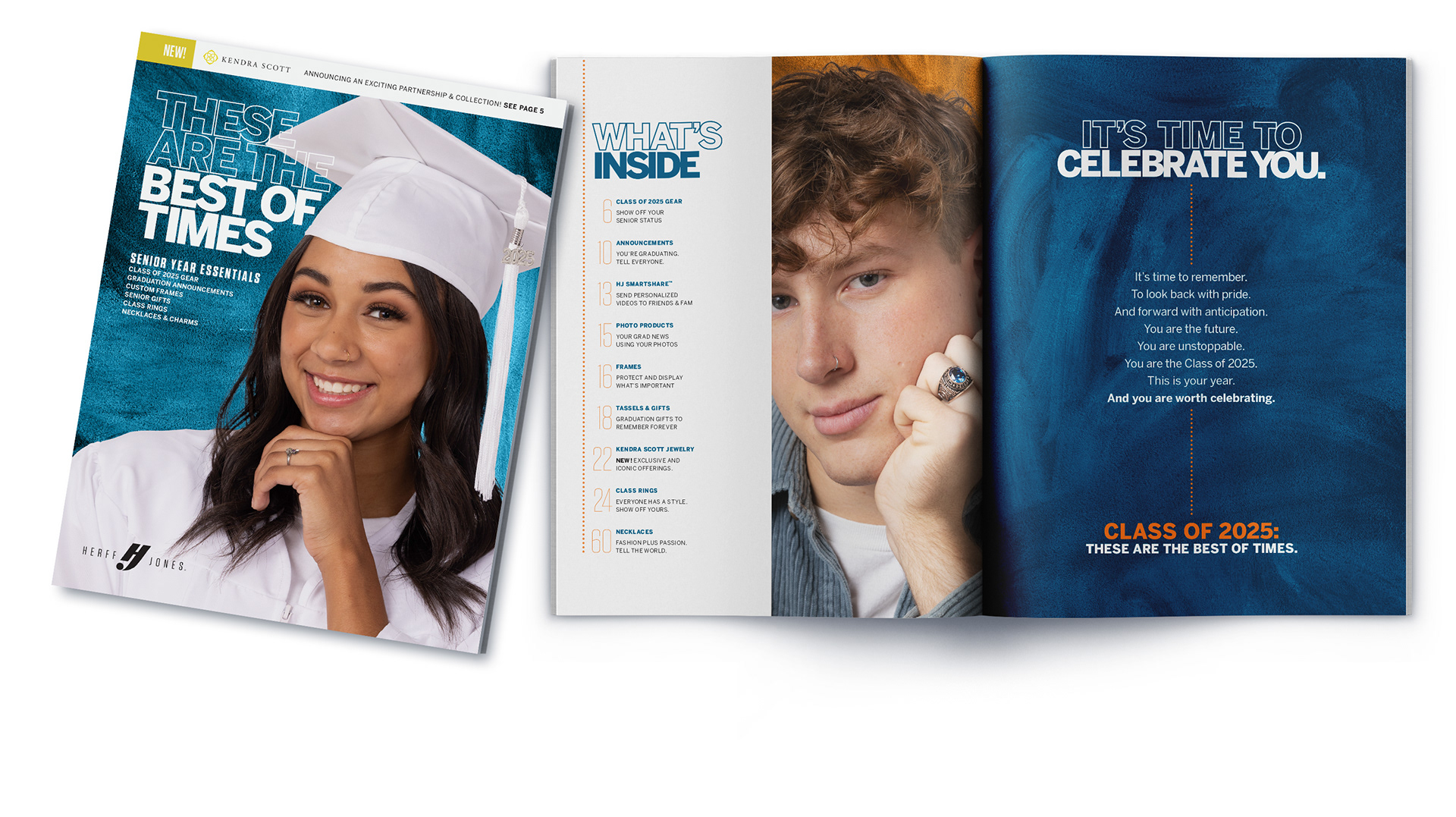
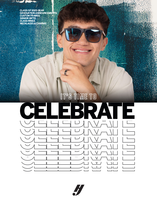
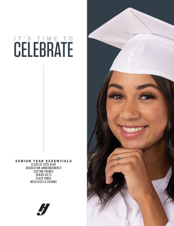
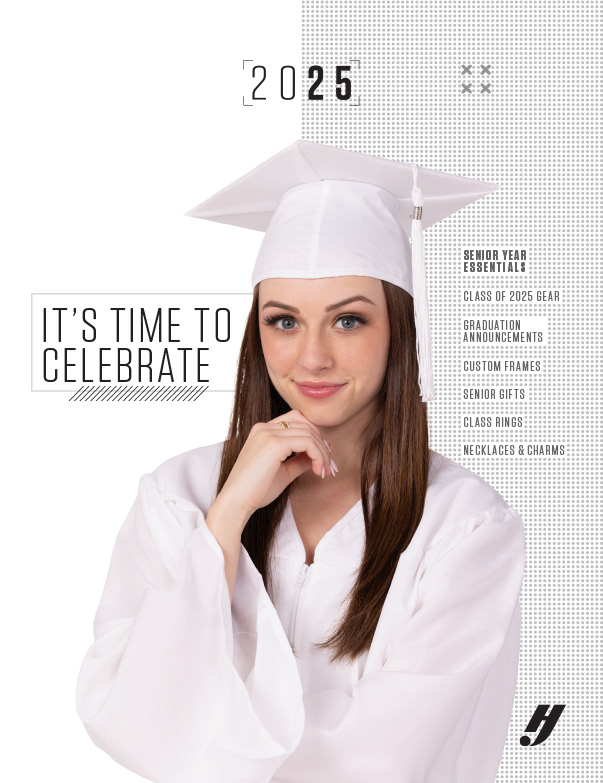
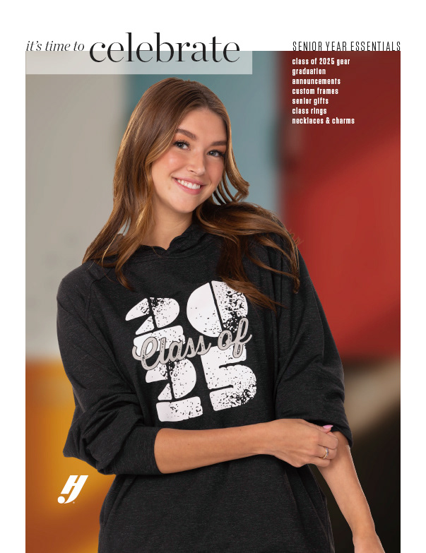
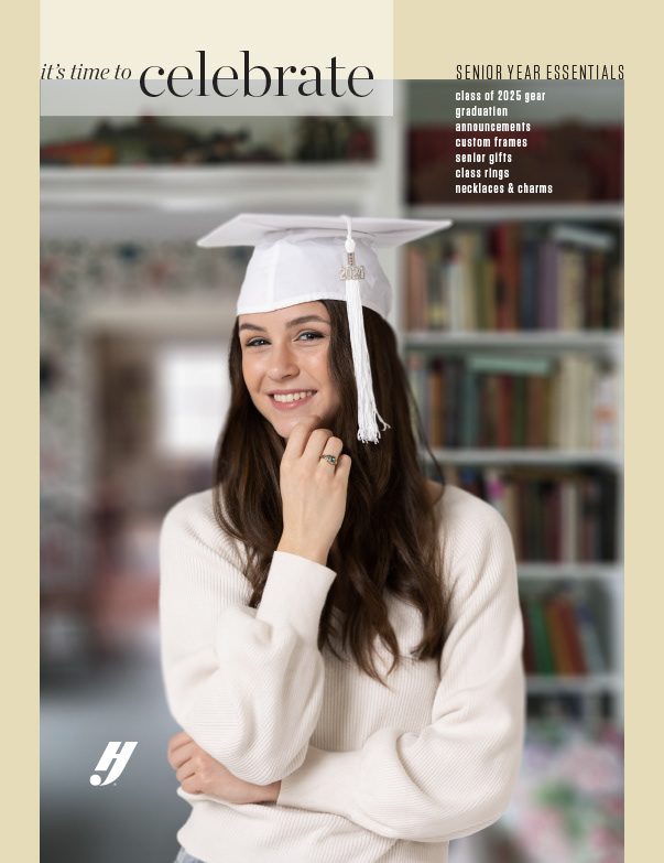
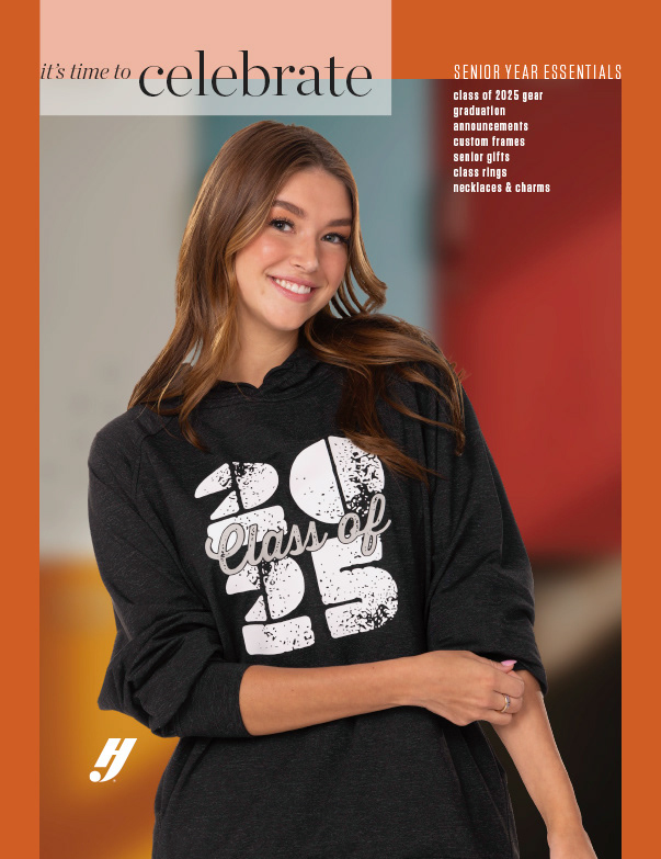
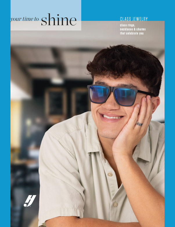
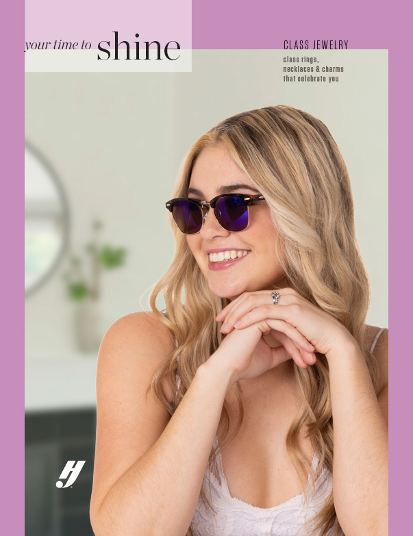
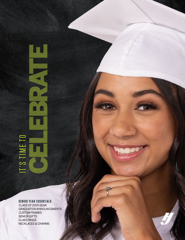
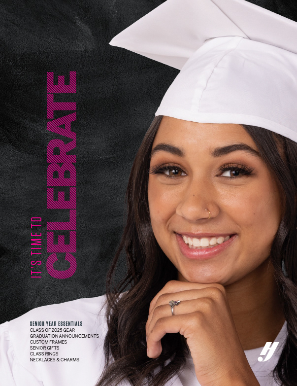
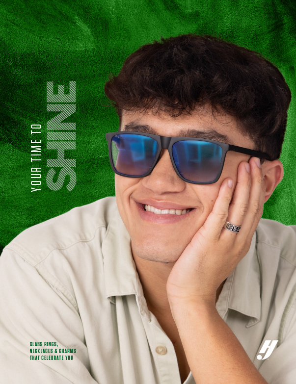
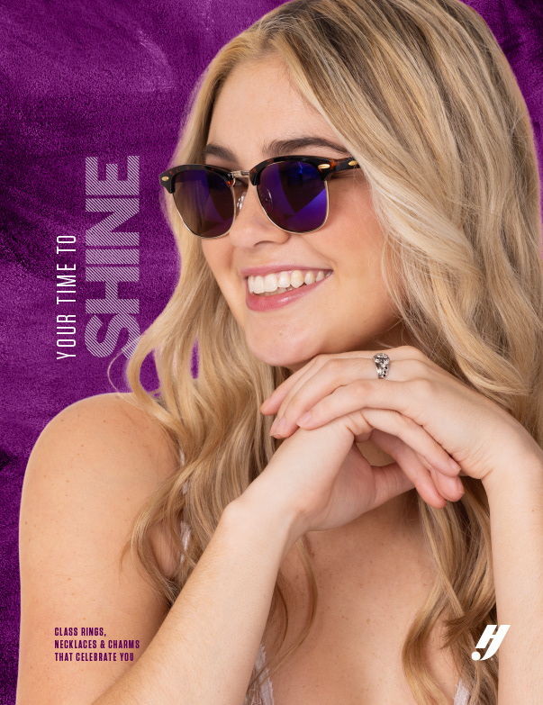
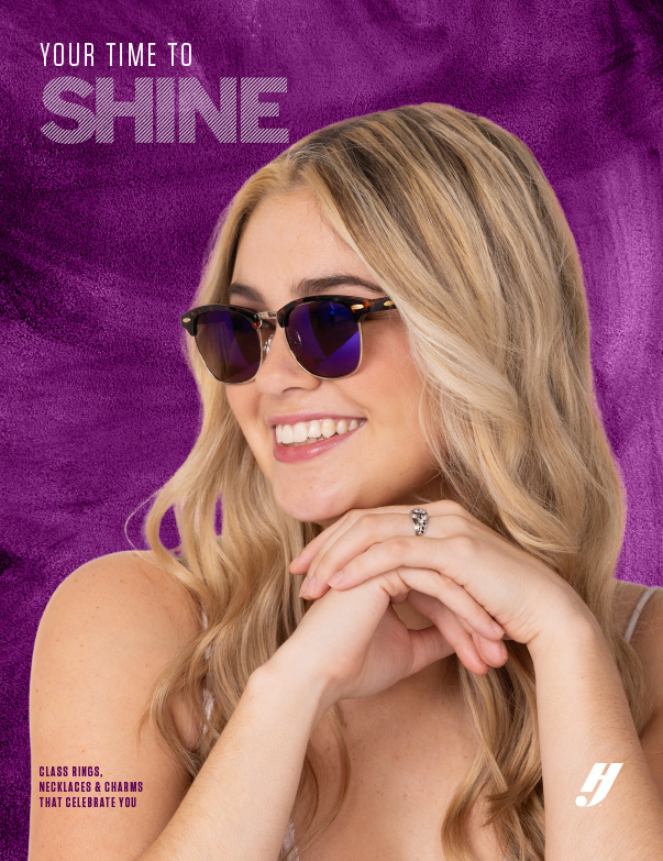
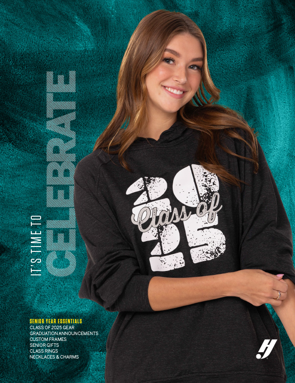
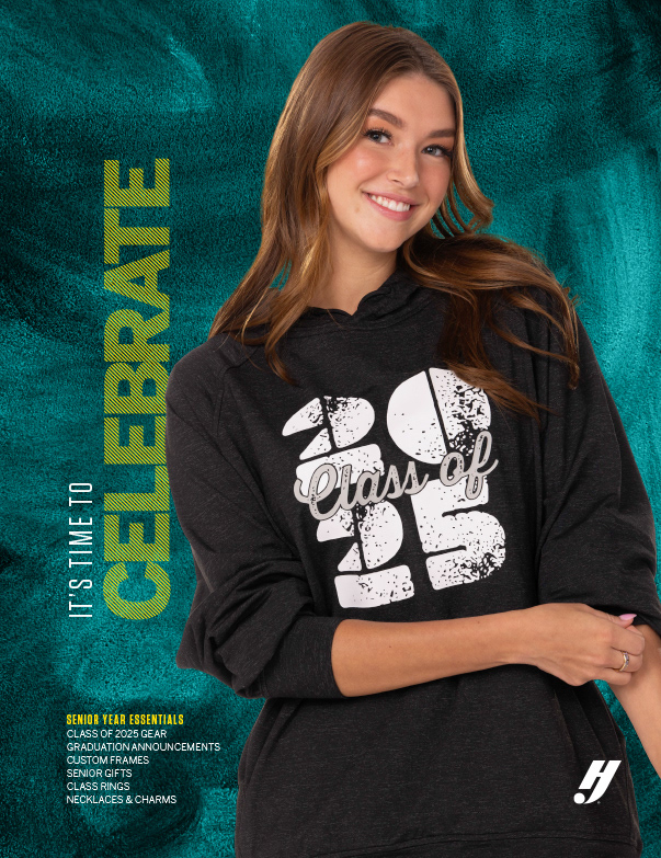
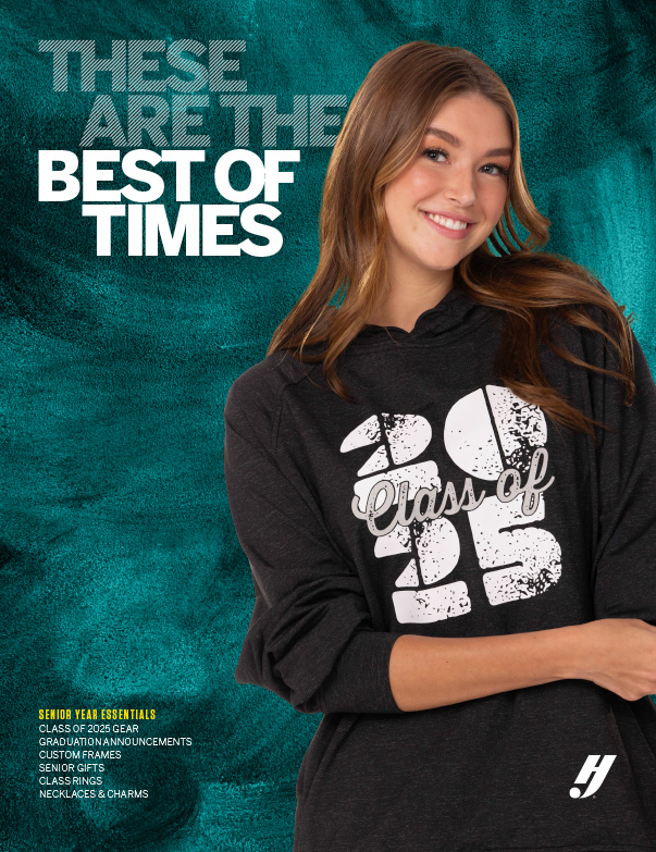
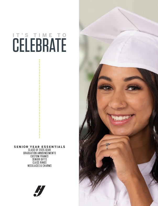
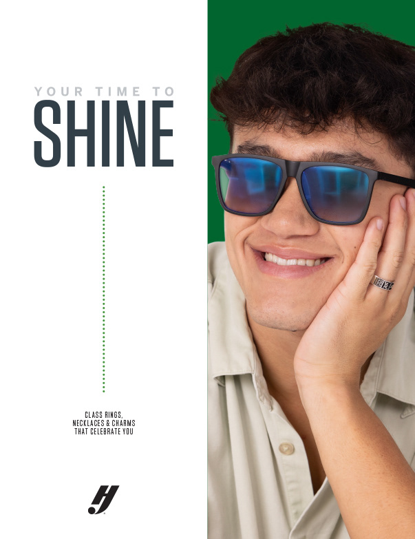
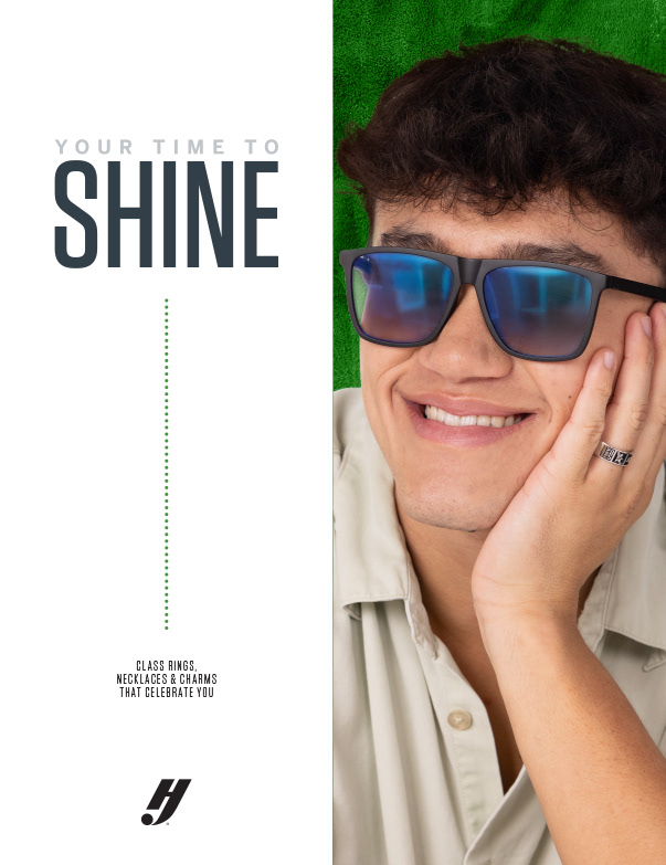
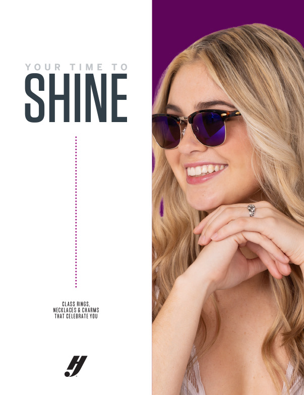
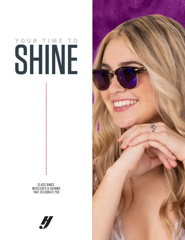
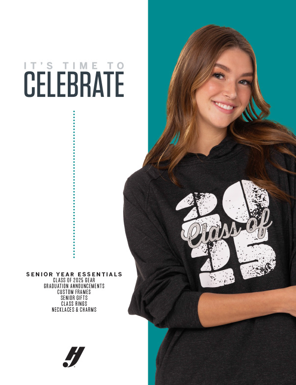
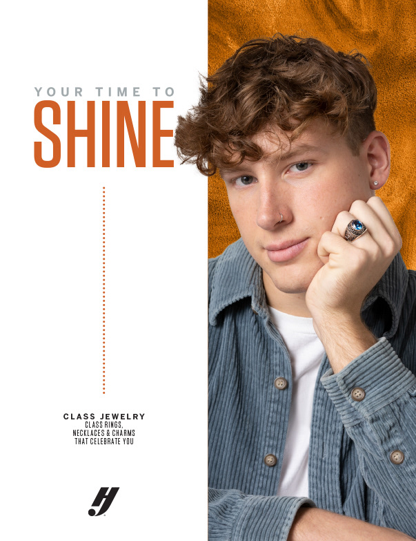
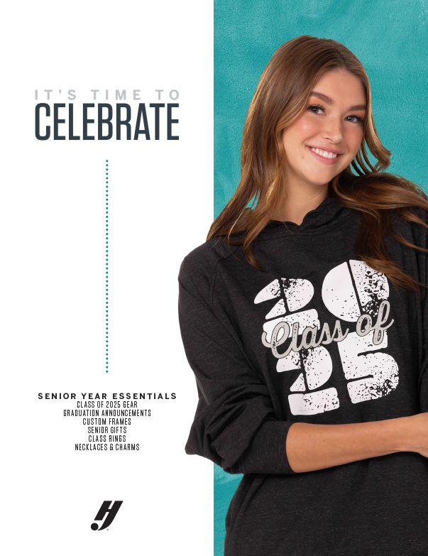
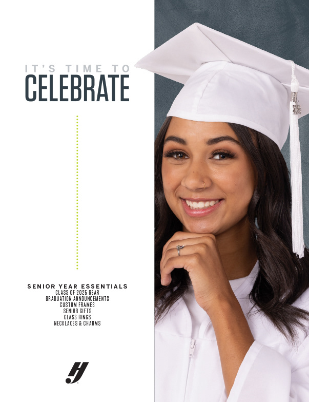
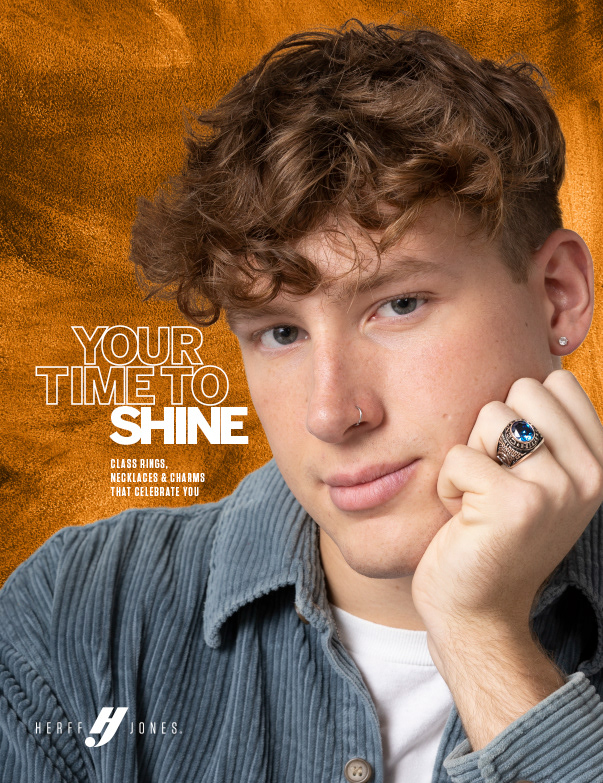
The covers for the prior year featured a color border; for 2025, we decided to feature each catalog's palette even more heavily, with bold color on the covers and over textured backgrounds throughout the interiors. Benton Sans, which has been front and center as HJ's primary typeface for a few years, remained so here with the slight tweak of splitting headlines into solid and outlined type. This is a look that has worked really well for us, and it's a basic enough twist to provide some visual interest without requiring much of a change to our approach. Similarly, the paint textures provided great backgrounds that were interesting, allowed type to still read well, and combined flawlessly with most any hue applied to it.
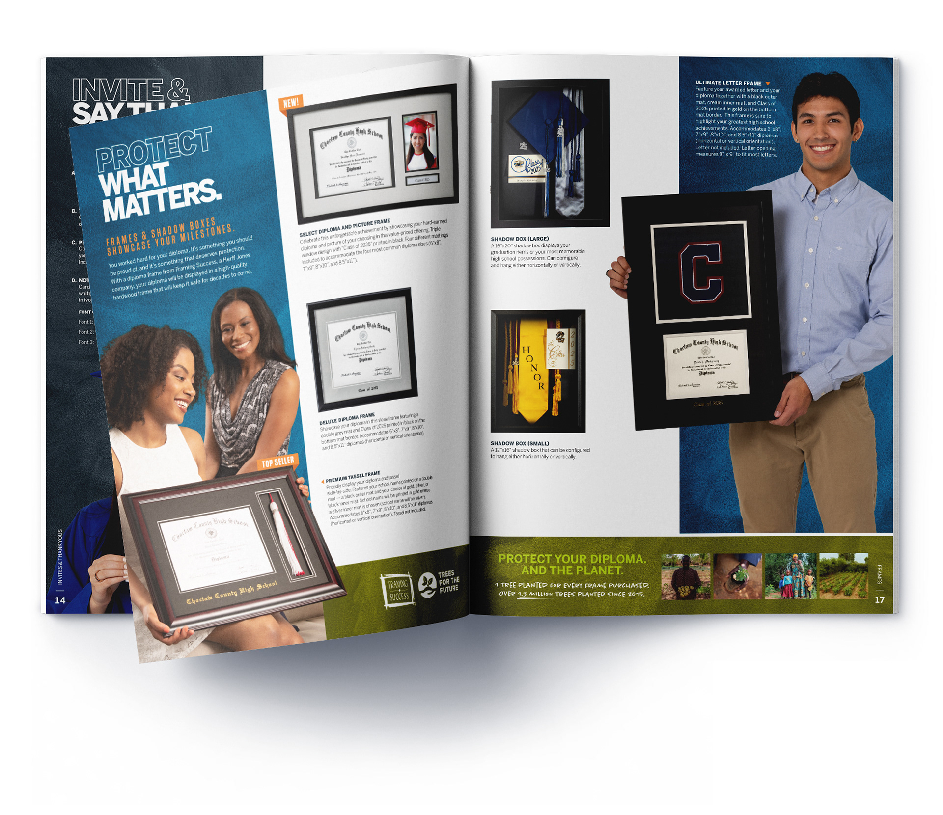
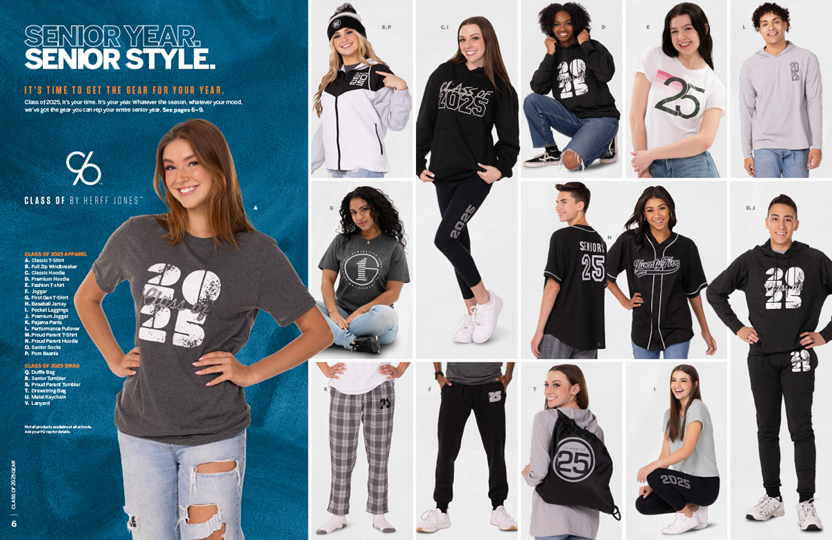
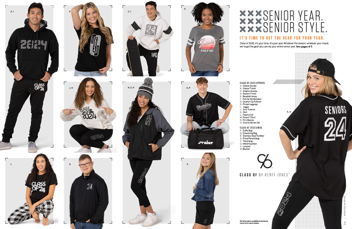
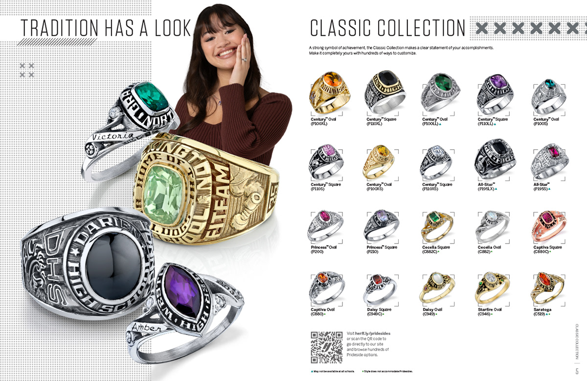
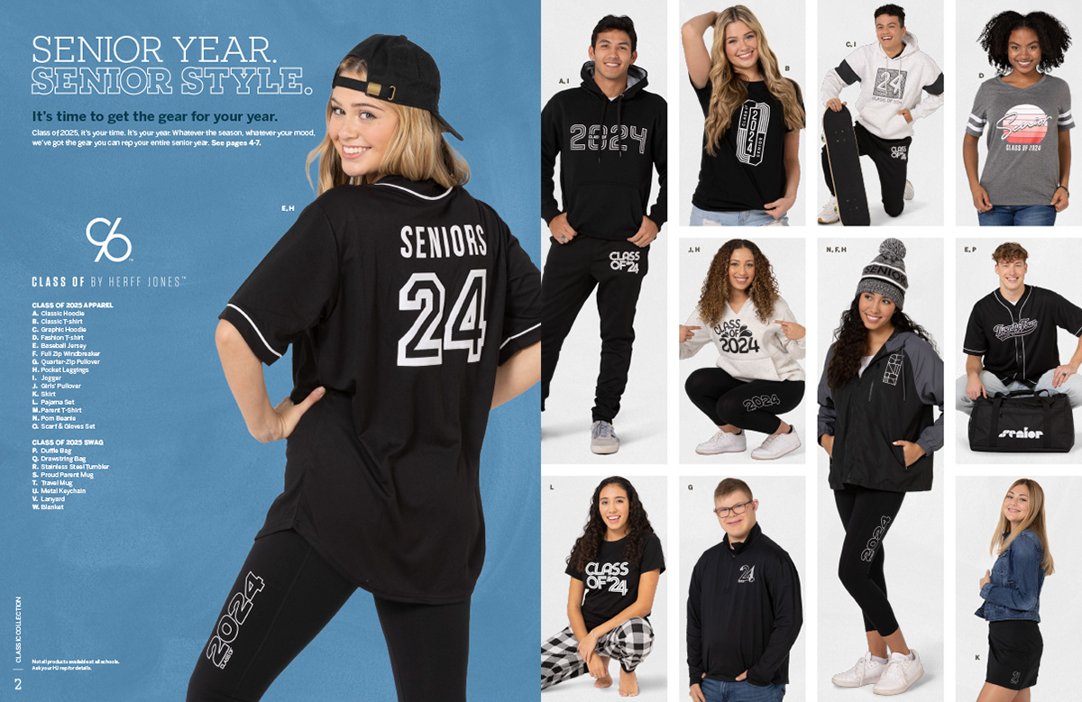
As before, my typical practice was to develop the Senior All-Inclusive Catalog first (since it contained all products), getting most everything approved and finalized, and then splitting its content out into other catalogs that contain various product lines. The condensed versions required additional layout work, since content is compressed rather than trimmed.
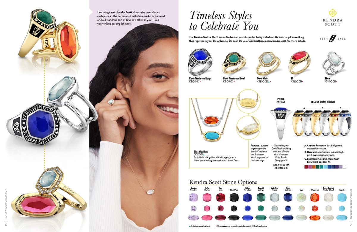
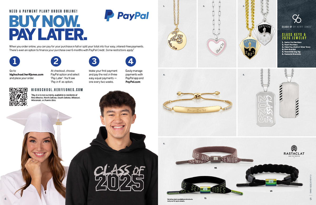
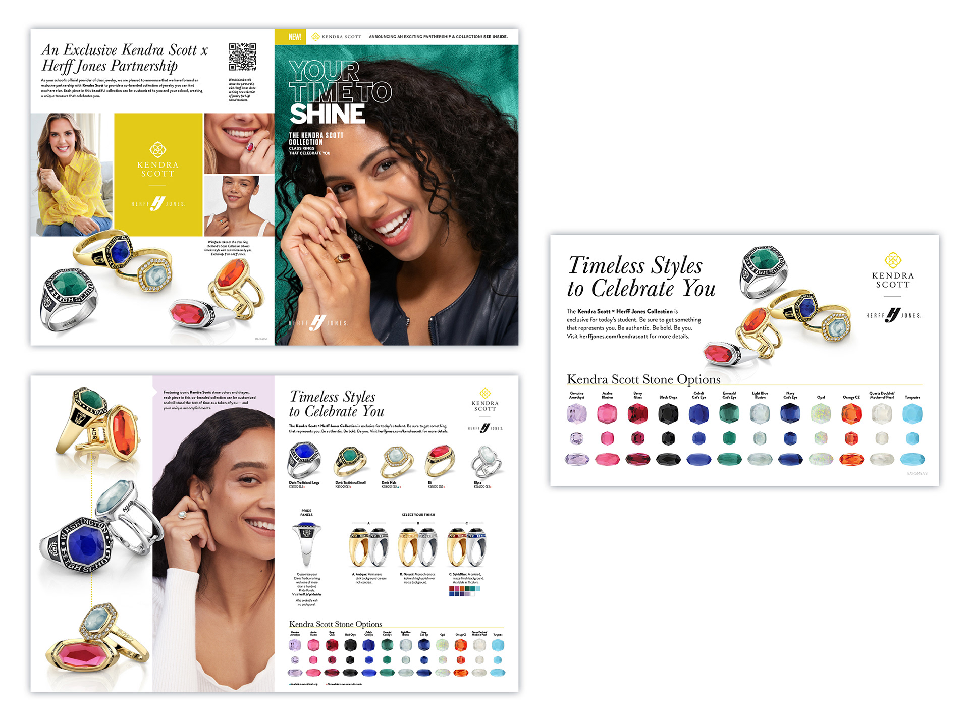
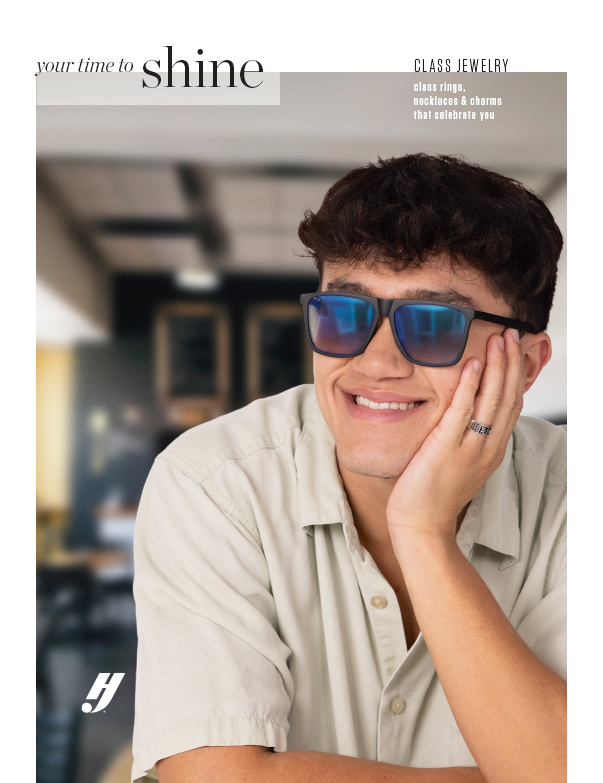
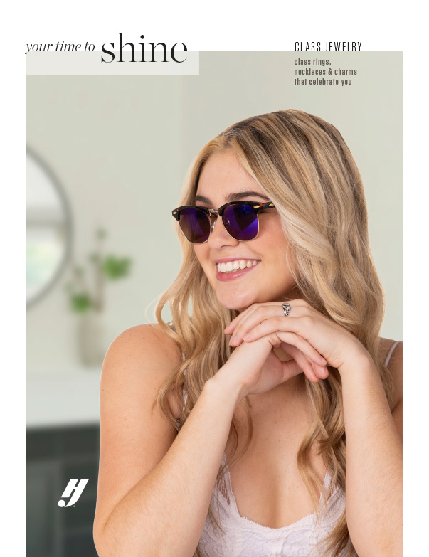
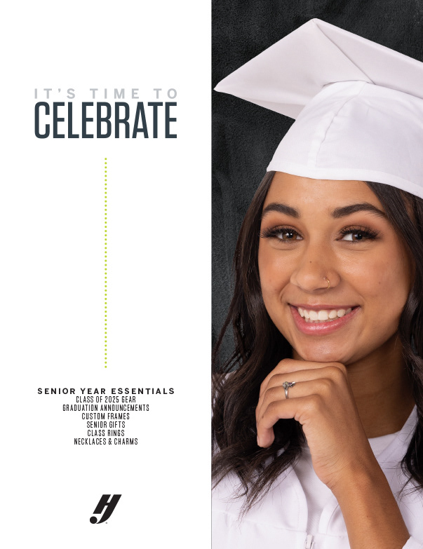
A significant change for 2025 was a partnership between Herff Jones and Kendra Scott, a fashion jewelry brand. Every catalog that included the new collection had a callout on the cover, but then we additionally pulled the pages about the partnership out to produce a standalone 4-pager and a postcard (shown right).
All these pages and details had to be approved by both HJ and Kendra Scott, which slowed down the process somewhat. We also deferred to their branding for these pages, using their typefaces (Baskerville and Brandon Grotesque), colors, and model photography.
All but one of these catalogs can be viewed online in full via the Issuu links below:
REJECTED CONCEPTS
I begin each catalog season with a period of experimentation, taking the content of the previous year and trying new things for covers and a key spread or two. For 2025, I was encouraged to go further off the beaten path than I had before: no color, typeface, or graphic element was sacred.
Even though the final product hewed closer to our typical style, this was still an incredibly useful process. Not only did it allow my creativity an unrestricted outlet, we also pulled concepts from some designs that likely would not have occurred to me without going through this alchemy of ideas. Some of these ideas may still be returning for 2026.
Round 1

Concept #1: Cover
Concept #1: Apparel Spread
Concept #1: Ring Spread
Concept #2: Cover

Concept #3: Cover
Concept #4: Cover
Concept #5: Cover
Concept #5: Apparel Spread
Concept #5: Ring Spread

Concept #6: Cover

Concept #7: Cover
Concept #7: Apparel Spread
Concept #7: Ring Spread

Concept #7a: Cover
Concept #7a: Apparel Spread
Concept #7a: Ring Spread
Concept #1: This was directly inspired by a film poster that I, sadly, cannot remember or locate at this point (if you know it, please send me an email! It was either a Japanese or South Korean film). The idea was to extrapolate circles, soft off-whites, and thin curving lines throughout a catalog. It's pretty, but a bit too understated for what HJ needed.
Concept #2: Not versatile enough (multi-line headlines don't work) and the outlined Tungsten subheader isn't real great or legible either.
Concept #3: I knew even while making this one that my Creative Director wouldn't love it, but wanted to mess around with something more inspired by retro digital interfaces. My intuition was correct; we did not pursue this at all.
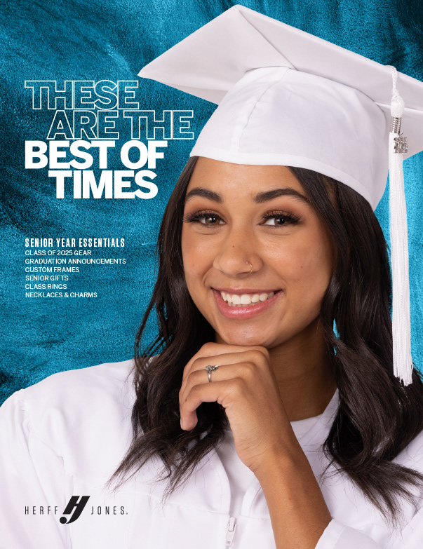
Concept #4: A strong contender, which persisted through Rounds 2 and 3. The critical element that lived on all the way through to the final catalogs was the idea of having a split vertical page with color on one side.
Concept #5: Inspired by sci-fi video games, heads-up displays, and similar vibes. I still really like this concept, but it's true that any implementation of it takes some effort to finesse - it's not particularly drag-and-drop, and when multiple designers and a vendor will be following in your footsteps, something this finicky wasn't particularly well suited to the task.
Concept #6: This cover was inspired by the "home and garden magazine" vibe, and while we didn't ultimately go down this path, it was a fairly strong contender and I did develop several variants of it for a closer look.
Concept #7 & 7a: This style was more or less our status quo, but with a slab serif added over top of a texture. I duplicated the look with Benton Sans, our main brand sans serif, just as an option. This look, particularly with the paint texture, was one of the main seeds for the final look of the catalogs.
Concept #2: Not versatile enough (multi-line headlines don't work) and the outlined Tungsten subheader isn't real great or legible either.
Concept #3: I knew even while making this one that my Creative Director wouldn't love it, but wanted to mess around with something more inspired by retro digital interfaces. My intuition was correct; we did not pursue this at all.
Concept #4: A strong contender, which persisted through Rounds 2 and 3. The critical element that lived on all the way through to the final catalogs was the idea of having a split vertical page with color on one side.
Concept #5: Inspired by sci-fi video games, heads-up displays, and similar vibes. I still really like this concept, but it's true that any implementation of it takes some effort to finesse - it's not particularly drag-and-drop, and when multiple designers and a vendor will be following in your footsteps, something this finicky wasn't particularly well suited to the task.
Concept #6: This cover was inspired by the "home and garden magazine" vibe, and while we didn't ultimately go down this path, it was a fairly strong contender and I did develop several variants of it for a closer look.
Concept #7 & 7a: This style was more or less our status quo, but with a slab serif added over top of a texture. I duplicated the look with Benton Sans, our main brand sans serif, just as an option. This look, particularly with the paint texture, was one of the main seeds for the final look of the catalogs.
Round 2
1
2
3
4
5
6
7
8

9

10

11
12
13
14

15
16
17
18
19
20

21
22
23
24
25
26
27
28
29
30
Three main concepts were selected to carry on to a second round of experiments. The first 8 covers above were the extrapolation of the home & garden look, using different models and backgrounds to see how adaptable it was, and to see how they'd look with a color border. Ultimately, while we all liked this look, it wasn't really suitable for the catalogs: it didn't grab your eye strongly enough, and reverting to Chronicle as our primary typeface would have created some headaches (we had used it in that capacity for two years a ways back, and found it didn't work well in a digital environment).
Concepts 9-20 were all further explorations of the paint texture idea, married with a few different headline treatments. #11 was the closest to what the final covers actually became, as it was determined that the outlined type was more readable than the diagonal line fill. Horizontal type was also selected as preferable to vertical, rotated headlines (imagine trying to use that in an email header).
Concepts 21-30 were, frankly, my darlings. This was my favorite concept, so here I tried approaching it with and without texture, or even with a natural background (as in 23).
Round 3
1
2
3
4

5
6
The final round came down to two stylistic contenders, and once this decision was made it was merely fine tuning. When I created #1 I was sure, so sure, that it was the one. It was perfect. It's probably still the favorite cover I've ever made. Why did we go with the other concept? "People don't understand white space," is what my Creative Director told me. He made the point that our sales reps would likely complain about wasted space where there could be product or callouts or any number of other things. Whether that would have been the reaction in fact, I don't know, but he certainly had a point. Nearly all design is a compromise and, to be fair, I quite liked our other option as well. We moved forward with the paint texture idea for the covers, but we did retain the split-page concept for the interior of the catalogs, where it provided excellent visual dividers for different sections.